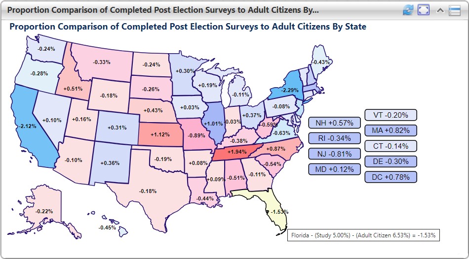
This portlet can be configured to show how a project's collected data compares to state-by-state expectations. The example below was used for an election study and shows the collected response distribution by state compared to the adult citizen population in each state. This is color coded based on a previous election cycle with the difference in distribution heat mapped with zero being the lightest shade. This portlet allows project managers to make adaptive design decisions to adjust collection efforts to better meet geographic distribution goals.
Portlet Main Image
Portlet Long Description
This example shows a hover over tooltip for Florida]s data.
Challenge Addressed
How do you monitor geographic distribution of your data collection?
Audience
Portlet Family